Understanding Color Psychology in Interior Design
Color psychology plays a pivotal role in shaping the mood, perception, and atmosphere of interior spaces. From the energetic vibrance of reds to the calming serenity of blues, the choices made in color palettes influence how we experience and interact with our environments. Interior designers harness the psychological effects of colors to craft purposeful and emotionally resonant spaces—tailoring homes, offices, and commercial interiors to meet functional goals and personal tastes. This page delves into the science and art of color psychology, exploring how different hues impact our emotions, behaviors, and well-being, and offering guidance on integrating color theory into successful interior design.
The Biological Response to Color
When we see colors, the human brain processes visual information quickly, triggering a range of emotional responses. Warm colors like red and yellow can stimulate excitement or appetite, while cool shades like blue and green tend to calm the mind and reduce stress. These reactions are not merely psychological; they are also physiological, with measurable impacts on heart rate, blood pressure, and even hormonal balance. Interior designers use this knowledge to craft environments that energize, relax, or refresh occupants, capitalizing on the intimate connection between color and well-being.
Cultural Influences on Color Perception
Color meanings are not universal. While white is often associated with purity in Western cultures, it may symbolize mourning in parts of Asia. Similarly, red can signify luck in China but symbolize danger elsewhere. Understanding these cultural nuances is vital in interior design, especially for spaces that cater to diverse clientele or global audiences. Designers must research and respect cultural associations, integrating colors thoughtfully to create spaces that are both beautiful and culturally sensitive.
Color Associations and Emotional Impact
Beyond biology and culture, personal experiences shape how individuals perceive and react to color. Childhood memories, personal tastes, and even seasonal changes can influence color preferences. For example, a person who grew up near the ocean might find blue shades comforting and nostalgic, whereas another might feel invigorated by citrus hues. Interior design becomes most meaningful when it takes these unique emotional associations into account, creating spaces that feel personal and supportive for their inhabitants.

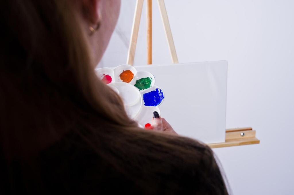
The Power of Red in Design
Red is the color of passion, excitement, and energy. Used wisely, it can bring a sense of warmth and vibrancy to spaces like dining rooms or living areas, stimulating conversation and appetite. However, overstimulation from strong reds can lead to feelings of agitation or discomfort, especially in relaxation zones like bedrooms. Interior designers often use red as an accent rather than a dominant color, allowing its stimulating properties to enliven a space without overwhelming it.
Blue’s Calming Influence
Blue is renowned for its calming and restorative effects. It evokes the tranquility of water and sky, making it a popular choice for bedrooms, bathrooms, and quiet retreats. Blue hues can help lower blood pressure and slow respiration, inducing a sense of peace. However, an overabundance of deep blues may feel cold or isolating. Designers frequently balance blue with warm accents or natural materials to create spaces that are both serene and welcoming.
Yellow’s Uplifting Qualities
Yellow is associated with happiness, optimism, and energy—like a burst of sunlight indoors. When applied thoughtfully, yellow can brighten small or dark spaces, making them feel more open and inviting. Yet, too much yellow, especially in intense tones, can lead to feelings of frustration or anxiety. Successful interiors use yellow as a supporting color, harnessing its cheerfulness while ensuring a harmonious and comfortable overall scheme.
The Harmony of Greens
Green strikes a balance between the warmth of yellow and the tranquility of blue, symbolizing renewal, growth, and balance. It is particularly effective in interiors meant to foster relaxation and connectedness, such as living rooms or home offices. Green’s versatility extends from fresh, minty tones to deep, sophisticated emeralds—each offering a different energy. Designers often incorporate plants and natural textures alongside green to amplify its restorative effects.
The Invigoration of Orange
Orange combines the intensity of red and the cheerfulness of yellow, resulting in a color that promotes enthusiasm, creativity, and sociability. In interior design, orange can make communal areas feel more lively and dynamic, encouraging interaction and energetic conversation. However, as with all strong colors, moderation is key; small doses or softer, terracotta-inspired shades can prevent orange from becoming overpowering, producing balanced and inviting spaces.
Warm Colors for Inviting Spaces
Warm colors like reds, oranges, and yellows are known for making spaces feel more intimate, cozy, and welcoming. They are ideal for living rooms, dining areas, or entryways where a sense of hospitality is desired. These hues can visually shrink large or sparse rooms, creating a feeling of closeness and unity. Interior designers often use warm colors in combination with soft lighting and textured materials to enhance this inviting effect.
Cool Colors for Openness
Cool colors such as blues, greens, and purples tend to recede visually, making rooms feel larger and more spacious. These shades are perfect for compact areas or spaces intended for relaxation and focus, like bedrooms or study nooks. Cool colors can also temper excessive sunlight, promoting a cooler physical sensation. Designers leverage these attributes to make spaces feel open, airy, and calm, particularly where mental clarity and serenity are priorities.
Balancing Warm and Cool Tones
Effective interior design typically balances warm and cool colors to achieve a harmonious, adaptable environment. Too many warm tones may cause a space to feel stuffy or oppressive, while an overabundance of cool shades can make it seem clinical or uninviting. Strategic use of both temperature ranges allows designers to fine-tune the emotional tone of a room, matching it to intended activities, personal preferences, and architectural features.

The Psychological Effects of Neutrals
White and its various off-white shades symbolize purity, freshness, and simplicity. These hues can make rooms appear larger and brighter, serving as a neutral canvas that allows furnishings and decor to stand out. In minimalistic or modern interiors, whites foster clarity and organization, instilling a sense of order and serenity. However, excessive use without accent colors can lead to feelings of sterility or blandness, so designers often include texture or subtle undertones for warmth.
One effective use of accent colors is to call attention to specific areas or features in a room—such as a fireplace, a reading nook, or artwork. By choosing a color that contrasts with the primary palette, designers create an immediate psychological draw, helping users navigate the space and appreciate its unique assets. This targeted use of color enhances both aesthetic appeal and spatial organization.

Accent colors can also be used to establish harmony and flow throughout a home or commercial space. By repeating select hues in textiles, decor, or architectural details from room to room, designers weave a sense of continuity and intentionality. This not only unifies the visual experience but also reinforces the desired emotional atmosphere, making the transition between spaces seamless and comfortable.
Accent colors are perfect for introducing elements of personality and uniqueness into a design scheme. Whether through bold cushions, vibrant artworks, or playful accessories, these touches allow inhabitants to express individual tastes and moods. The psychological benefit is twofold: residents feel a sense of ownership and pride in their space, while visitors experience a welcoming environment that reflects genuine character.
Living Rooms and Social Spaces
Social areas like living rooms benefit from colors that promote comfort, conversation, and hospitality. Warm hues or balanced neutrals can enhance sociability, making guests feel at ease. Designers often include accent colors or patterned elements to stimulate visual interest, ensuring the space feels dynamic and inviting for gatherings, relaxation, or entertainment.
Bedrooms and Restful Retreats
Bedrooms are sanctuaries for rest and rejuvenation, so calming colors are key. Soft blues, greens, and muted pastels promote relaxation and facilitate quality sleep. Neutral backgrounds contribute to tranquility, allowing for subtle pops of color through bedding or decor. By curating a palette that soothes rather than stimulates, designers create bedrooms that truly support well-being.
Workspaces and Study Areas
Productivity and focus are crucial in work or study environments, making color selection especially important. Blues and greens support concentration, while touches of yellow or orange can boost creativity and energy. Too many bold colors may distract, so harmonious combinations ensure an optimal balance between stimulation and calm, enhancing both efficiency and mental clarity.
Trends and Timelessness in Color Choices
Each year, certain colors rise in popularity—often influenced by fashion, technology, or global events. While trendy hues like vibrant corals or deep greens can make a space feel on the cutting edge, they may also lose appeal quickly. Designers thoughtfully integrate trends through easily updated elements like cushions, artwork, or paint, preserving the longevity and adaptability of the overall design.