The Impact of Color Choices on Mood and Atmosphere
Color exerts a profound influence on human perception, shaping our emotions and setting the tone of any environment. Whether in homes, offices, or public spaces, the hues we encounter can evoke psychological responses that affect our well-being, productivity, and interpersonal interactions. This page explores how color choices, both bold and subtle, play a crucial role in fashioning the atmosphere of a space and directing the moods of those within it. Understanding these nuanced effects empowers individuals and professionals to craft environments that support their intentions, whether fostering calm, stimulating creativity, or encouraging social connection.
The Science of Color and Human Emotion
Physiological Responses to Color
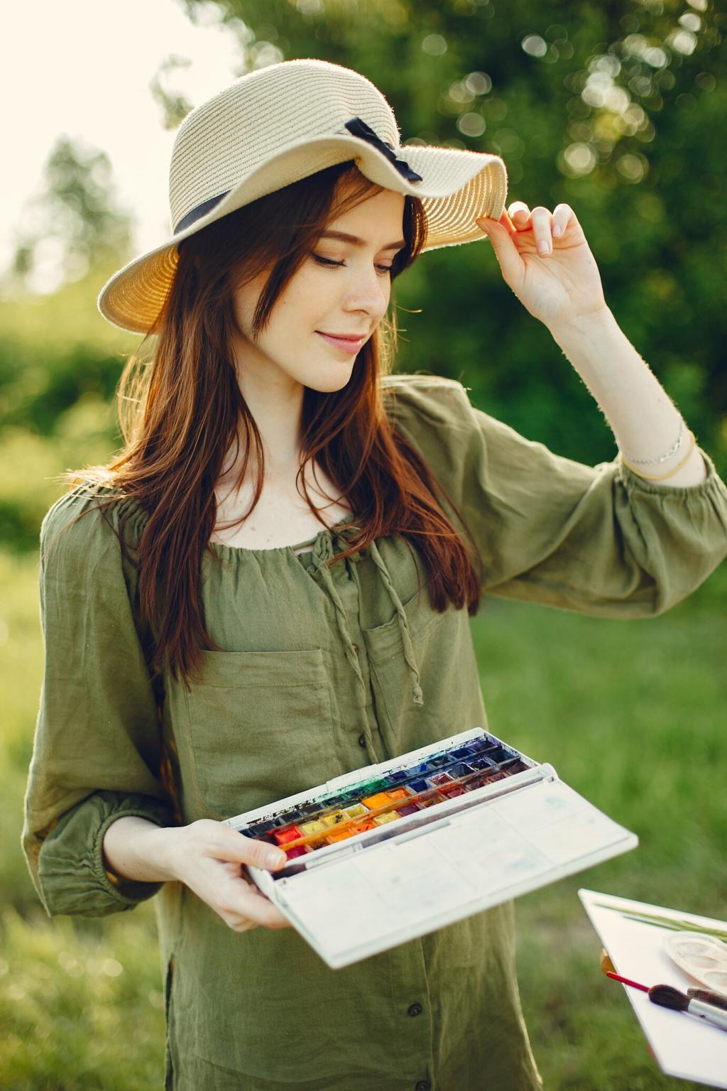
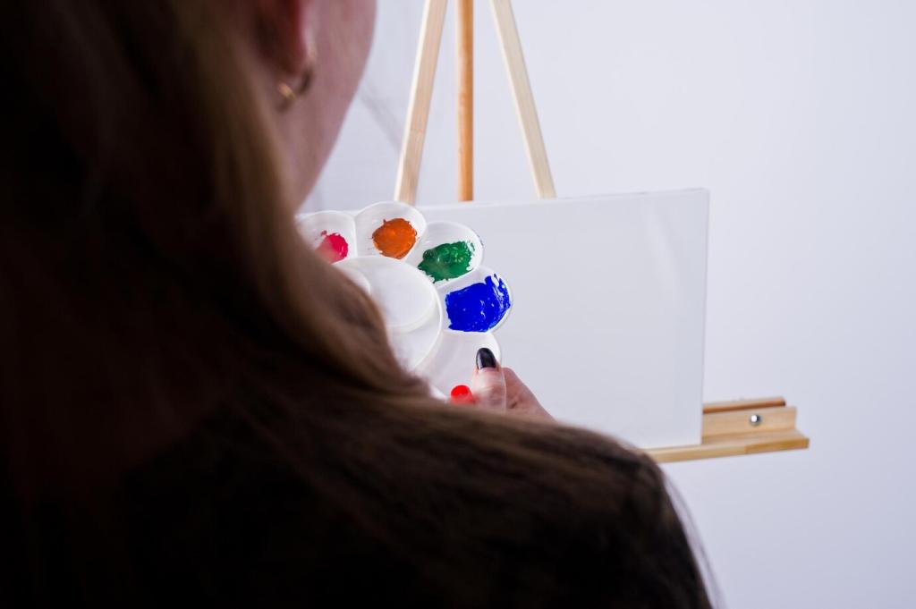
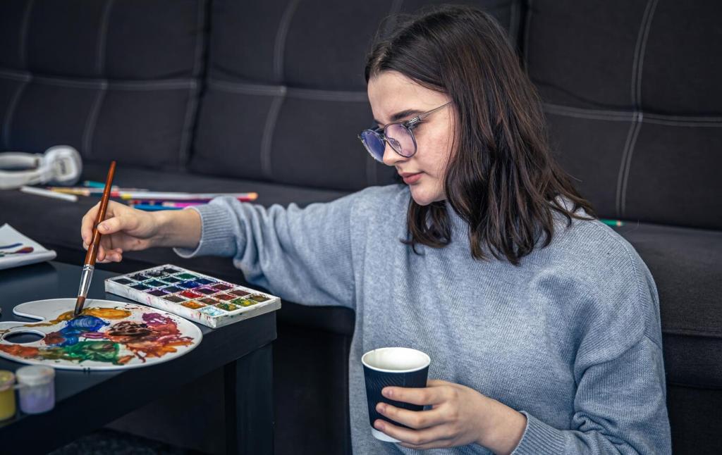
Exposure to different colors can prompt immediate physiological reactions. For instance, warmer hues such as reds and oranges may elevate pulse rates and increase adrenaline, leading to heightened energy and excitement. Cooler colors like blues and greens, on the other hand, tend to have a calming effect, encouraging relaxation and lowering stress. The body’s automatic responses to various shades suggest that color selection is not merely an aesthetic decision but a potent tool for shaping how people feel in a particular space. These effects can be strongest in environments where color saturation is high and natural light accentuates the chosen palette.
Color Psychology and Cognitive Bias
Color perception is intertwined with our cognitive processes, often coloring our memories and expectations. Studies in color psychology reveal that individuals tend to associate specific hues with certain qualities or emotions. For instance, yellow is commonly connected to optimism and happiness, while black might be linked to sophistication or mourning. These associations, whether learned or instinctive, inform our mental states when we interact with colored environments. Designers and architects utilize this psychological insight to evoke desired responses, carefully selecting palettes that align with the intended mood or message of a space.
Cultural Interpretations of Color
Beyond biological responses, cultural context profoundly shapes how we interpret colors. The same hue can evoke disparate emotions across cultures; for example, while white represents purity and peace in some societies, it symbolizes mourning in others. These cultural variances are pivotal in global design and branding, as what soothes or motivates one audience could alienate another. Understanding the interplay of cultural symbolism ensures that color choices are not only emotionally resonant but also culturally sensitive, maximizing comfort and acceptance.
Influencing Spaces: Color in Interior Design
Creating Comfort and Calm
Soft, muted colors such as pale blues, greens, and lavenders are often employed to instill serenity within living spaces. These hues are especially effective in bedrooms and bathrooms, where relaxation and unwinding are paramount. The gentle nature of these colors acts as a visual cue for the body and mind to slow down, making spaces feel inviting and restful. By leveraging these calming tones, designers can create havens from the hustle and bustle of the outside world, promoting wellness and mental clarity.
Energizing and Motivating Atmospheres
In areas intended for activity and alertness, such as gyms or creative studios, vibrant shades like red, orange, or yellow can invigorate and motivate. These intense colors are known to stimulate both mind and body, boosting concentration and enthusiasm. When used strategically—such as on a feature wall or through accents—these hues can prevent overstimulation while still infusing spaces with dynamic energy. The right balance ensures that environments remain uplifting and engaging, catering to productivity and inspiration.
Enhancing Social Interaction
Spaces designed for socialization, such as dining rooms and lounges, benefit from color choices that promote warmth and connection. Warm tones like earthy terracottas, deep reds, or rich golds can make environments feel more intimate and inviting, encouraging conversation and togetherness. These shades subtly break down social barriers, creating an atmosphere where people feel comfortable engaging with others. By understanding the social psychology of color, designers create settings that nurture bonds and foster memorable gatherings.
Workplace Environments and Productivity
In office environments where focus and sustained attention are essential, cool and neutral colors are often preferred. Shades like light blues, cool greys, and soft whites create an atmosphere of clarity and order, minimizing distractions and helping minds stay on task. These tones are especially effective in open-plan workspaces, where visual chaos must be controlled. The calming effect fosters a sense of stability, making it easier for individuals to manage stress and remain engaged with their work.